Colour psychology: how do colours affect your mind?

 · 5 min read
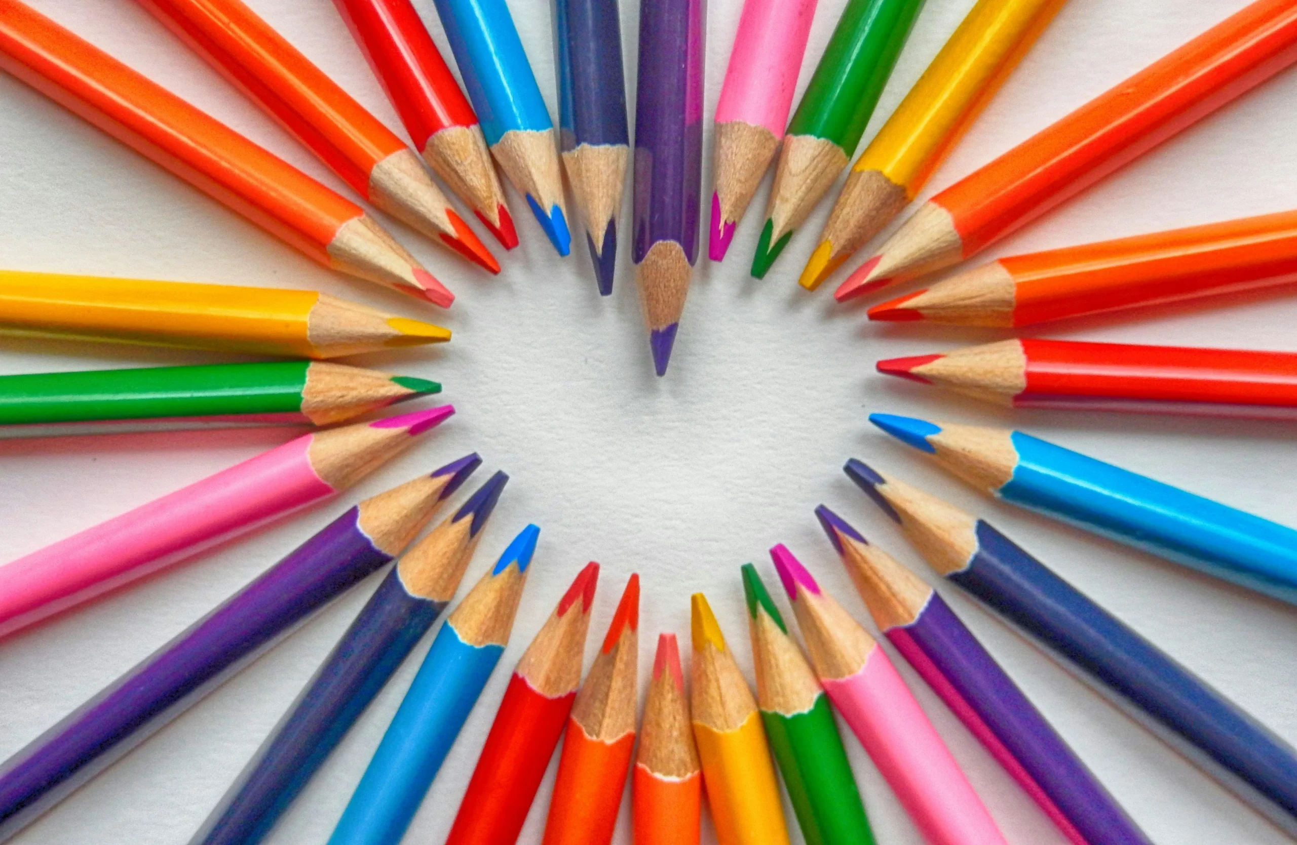
The field of colour psychology is vast. Although we deal with colours so much in everyday life, most people don’t know how strong their effect on us really is or how they can make use of it.
With this article, we would like to shed some light on the subject and show you that the colour of your jumper might make a difference after all. For you and for the people around you. Colours accompany you every day – in clothing, rooms, logos and in nature. Yet you often don’t even notice how strongly they shape your thoughts, feelings and behaviour. Colour psychology examines exactly this effect and shows that colours are not just aesthetic, but can also have real effects on your mental health .
“In the pink” or “feeling blue” – even our everyday language makes it clear that colours express emotions and can affect us both positively and negatively. So colours are far more than decoration: they influence our mood, our thinking and even our physical reactions.
What is colour psychology?
Colour psychology describes how colours influence our psychological, emotional and physical world. It is used in marketing to deliberately steer perception, behaviour and purchasing decisions. In everyday life, too, knowledge about colours can help to regulate mood, boost creativity or reduce stress. Even small adjustments to your clothing, furnishings or workspace can have a big impact.
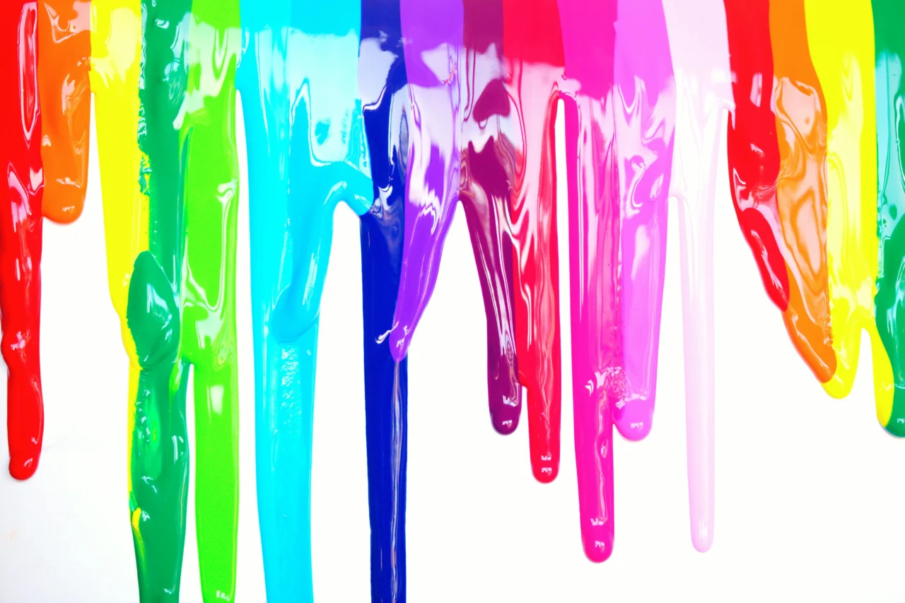
What effect do red, pink and orange have?
Red is considered the colour of dynamism, passion and strength. A strong red can activate the senses, increase energy and boost motivation. However, if you are feeling stressed, you should use red sparingly, as it can intensify inner restlessness.
Pink, on the other hand, has a calming effect and encourages compassion and inner balance.
Orange, the colour of the sacral chakra, conveys warmth, optimism and energy. An orange accent in your living or working space can lift your mood and release emotional blockages. In stressful times especially, it is a good idea to use orange deliberately.
How do yellow and green influence our mind?
Yellow is associated with sunshine, joy and curiosity. Warm shades of yellow encourage optimism, creativity and a good mood, whereas very bright shades can drain energy.
Green, the colour of the heart chakra, has a calming effect and creates harmony and balance. Light green signals new beginnings and renewal, while dark green conveys stability and inner calm.
Recent studies show that green has positive effects on children’s learning: they respond in a more relaxed way and are more receptive (Müller, 2024). At the same time, a study by Kersch (2005) shows that children don’t always like green – presumably because they do not yet consciously perceive its nuances, whereas adults appreciate its harmonising effect.
What role do blue and violet play?
Blue is often associated with calm, trust and communication. Light blue stimulates creativity and openness, while dark blue supports reflection and self-care.
Violet combines the calming effect of blue with the dynamism of red and supports meditation, visualisation and inner balance. Studies show that blue can improve cognitive performance and reduce stress, while red increases physical performance (Minychthaler, 2017).
What effect do black, white and brown have?
Officially, black, white and brown are not categorised as colours, but they too deserve attention in colour psychology.
White symbolises new beginnings, purity and possibility, but it can also feel overwhelming.
Black stands for withdrawal, protection or distance, but also for loneliness.
Brown conveys groundedness, stability and rootedness, but can encourage stagnation if it is used too dominantly.
In everyday life, this means: black as a background colour makes other colours stand out, white makes rooms look bigger, and brown creates a sense of security. Clothing can also benefit from these insights: brown has a calming effect, while black comes across as more reserved.
How can mindfulness help in dealing with colours?
Mindfulness means consciously noticing how you feel, without judging. Mindfulness can also help when it comes to using colours: observe which shades lift your mood and which tend to stress you. Perhaps you’ll notice that a bright yellow motivates you, while a garish red creates restlessness.
By shaping your surroundings mindfully – your clothing, home or workspace – you can deliberately reinforce positive effects. In this way, mindfulness helps you to reflect on your reactions to colours and to make conscious decisions, rather than being unconsciously influenced by your environment. Colour psychology thus becomes a tool for fostering mental balance, creativity and quality of life in the long term.
Which recent studies confirm these effects?
Numerous studies demonstrate the measurable effect of colours on emotions, behaviour and cognitive performance: Gleixner (2017) showed that deliberate use of colour in film steers emotional reactions and attention, and Minychthaler (2017) showed that red increases strength performance in sport. Müller (2024) found that colours have positive effects on children’s learning. Research by Kondratiewa (2024) and Bábíková (2011) illustrates that the choice of colour in marketing influences decisions, motivation and brand perception.
A systematic review from 2025, which analysed 132 studies from 64 countries with more than 42,000 participants, also shows that colours are consistently associated with certain emotions across cultures. These findings confirm the classic assumptions of colour psychology and make it useful in everyday life as well as at work and in creative processes.
How can I apply colour psychology in everyday life?
Colour psychology can be put to practical use in many ways: a study in blue can enhance focus and creativity, while a bedroom in green or violet supports relaxation and recovery. A workout area in red increases motivation and performance, and living or dining areas in orange convey optimism and warmth.
Clothing, accessories and decorations can also be used deliberately to regulate your mood, motivation or stress levels. Mindfully observe how colours affect you, and shape your surroundings deliberately to make use of the positive effects of colour psychology.
Conclusion: how can you use colours consciously?
Colours are powerful tools for mind and body. They influence mood, performance and perception – in everyday life, at work and in creative processes. By consciously using colour in your rooms, clothing or accessories, you can increase your wellbeing, motivation and emotional balance.
Combine colour psychology with mindfulness by observing how colours affect you and consciously adapting your surroundings. In this way, you strengthen your mental health, foster creativity and improve your quality of life in the long term.
Katharina R. (psychology student)
revised on 25 September 2025
Would you like to delve deeper into the world of colour psychology?
Colours are a fascinating field of psychology. They can be interpreted in many different ways, whether spiritually, mentally, physically or geographically. You will always find differences. So if this article on colour psychology has inspired you to learn more about this wonderful subject, there are books and podcasts on colour psychology to explore.
Deepen your meditation practice with Mindfulife
Meditation can be more than a short break in your everyday life. If you would like to understand more deeply how meditation works, how to build a steady practice of your own and how to guide others mindfully, our meditation teacher training is the next step. There you will not only get to know meditation in theory, but also develop more confidence, clarity and trust in your own practice.
Would you like to find out more about the training first? In our weekly webinar you will get an insight and learn more about what your path to becoming a meditation teacher could look like.
For regular support in your everyday life, you can also use our online meditation studio and join guided meditations flexibly via Eversports.
We look forward to accompanying you on your journey.
You can find more mindfulness inspiration on our channels too
References
Bartel, S. (2003). Farben im Webdesign: Symbolik, Farbpsychologie, Gestaltung. Springer Berlin / Heidelberg. https://ebookcentral.proquest.com/lib/badhonnef/detail.action?docID=6283616
Bábíková, M. (2011). Farbpsychologie in der Werbung und der Werbesprache; Colours Psychology in Advertising and Advertising Language. Univerzita Tomáše Bati ve Zlíně.
Elliot, A. J., Maier, M. A., Moller, A. C., Friedman, R., & Meinhardt, J. (2014). Color psychology: Effects of perceiving color on psychological functioning in humans. Annual Review of Psychology, 65, 95–120.
Gleixner, L. (2017). Farbpsychologie im Film: Die psychische Wirkung von Farben auf den Betrachter, deren Erzeugung und Verwendung im Film und die gestalterischen Potenziale im Postprocessing [Bachelorarbeit]. Hochschule für Technik Stuttgart.
Kersch, C. (2005). Kinder lehnen die Farbe Grün komplett ab: BAW-Studie untersucht Farbpsychologie unter Marketinggesichtspunkten. Lebensmittel Zeitung, 49, 045.
Kondratiewa, E. A. (2024). Die Bedeutung von Farben im Marketing.
Meixner, S. (2011). Warum OP-Kittel grün sind: Farbpsychologie. KMA - Klinik Management Aktuell, 16(12), 61. https://doi.org/10.1055/s-0036-1576275
Minychthaler, T. C. (2017). Farbpsychologie im Sport – Einfluss der Farbe Rot auf die Kraftleistung.
Müller, M. (2024). Die Wirkung von Farben auf den Menschen – wie Farben einen positiven Einfluss auf das Lernen von Kindern ausüben [Bachelorarbeit]. PHSG.
Riedel, I. (2022). Die Symbolik der Farben: Eine tiefenpsychologische Farbenlehre. Patmos Verlag.
Sera Benia Verlag GmbH. (2023). Farbpsychologie – So nutzt du die Wirkung von Farben für Gesundheit und Wohlbefinden. In Listen again (Nr. 206). https://sera-benia.de/pages/alle-podcast-folgen
Stabenau, E. (2004). Farbpsychologie; Farbpsychologies. Netbib.
Trade Journals. (2009). Farbpsychologie – Blau regt Kreativität an. Wirtschaft & Weiterbildung, 20(03), 31.
Trade Journals. (2016). Grün ist die Hoffnung und Blau steht für Treue: Farbpsychologie und deren Anwendung in Marketing und Marktforschung. Planung & Analyse, 5, 46–47.